
Q2. Consistency design examples
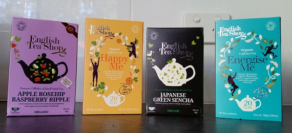
The English Tea Shop brand of teas provide a good example of design that is consistent both internally and externally. Each tea has consistent design within it internally, but there are also enough similar elements used in each of the different varieties that the branding is still easily recognizable externally across varieties. They are easily identified as components of a whole, and this is consistency which “incorporates the visual flexibility to create identifiable regions and edges within the larger space” (Lynch & Horton, 2009, p. 98). That is, the tea types are not exactly the same but are still recognizable and linked by certain consistent design choices.
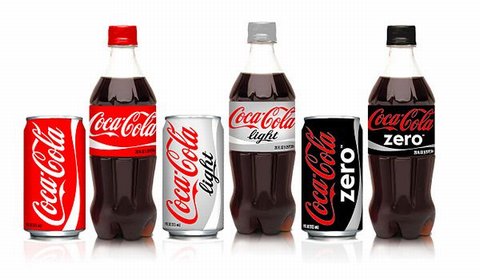
Coca-Cola has consistent branding across their products. Lynch and Horton note, “there is a paradox at the heart of consistency: if everything looks the same, there are no edges. How can you tell where you are or when you have moved from one space to another?” (Lynch & Horton, 2009, p. 98). The answer is keeping a consistent design profile whilst tailoring small details to indicate difference. For coke cans and bottles, each design is essentially the same, with colour indicating whether it is regular, diet or zero, and a font change for the ‘diet’ or ‘zero’ part. The difference in products is instantly recognized by consumers, but always as a difference of product types within one brand.
(https://7pennies.files.wordpress.com/2013/01/coca-cola-bottles.jpg)
Another example is public signage. Signs need to be simply and easily, if not instantly understood, especially if there is potential danger, or they are road signs which will be read whilst driving past. The red circle and crossed line are universally and consistently used to indicate that something is forbidden. This means that the learning curve for what a sign means is very small. This consistency of design allows for very effective usability and learnability.

