learning portfolio 4 – activity

Activity

Reputed

https://theconversation.com/au

conversation

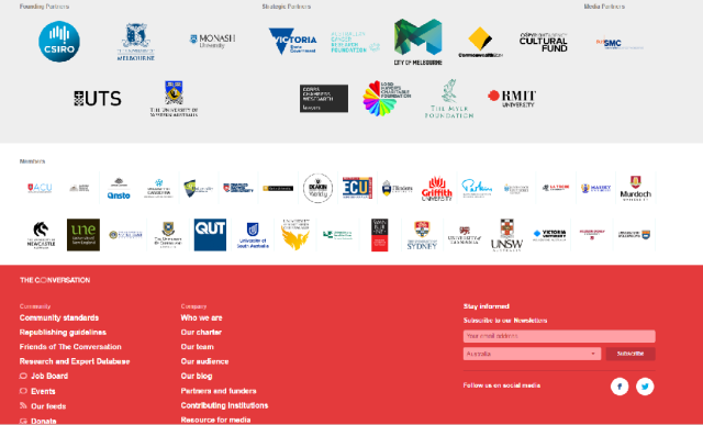
The Conversation is a news and opinion site that was founded in a partnership between the CSIRO and several high-profile universities.  It offers news and opinion pieces which are well-referenced and can be cited.  It is reputable enough to be cited by ABC news, which vouches for the quality of content. Having read it for some time the articles are always written to a high standard, and although opinion is offered it is always backed up with supporting research.

conversation founding partners

Earned

http://www.imdb.com/

imdb

IMDB – The Internet Movie Database – is a website that I have been visiting for many years, and it has always provided accurate information.  It lists extensive information about movies and tv shows and the production crew and actors involved.


Presumed

https://www.getup.org.au/

getup

Getup! is a non-profit petition website wherein different organizations and charities can host petitions and donation drives. I have not used it personally but have seen various friends on Facebook sharing different petitions for many years, so I presume it is credible.


Surface

http://www.dailylife.com.au/

daily life.png

Daily Life is a website I have never really used, but I am aware of because I follow the work of some of the contributors on Facebook who cross-post their articles. On the surface it looks life a well-designed, professionally run news and opinion website. It follows the standard pattern of a typical news site, and is easily skimmed and navigated.

learning portfolio 4 – Q3

Q3.

  • Contact information – for some websites a phone number or physical address are unnecessary, but an email and some sort of short biography about the site administrator are a good idea
  • Advertising – are there pop-up ads? The use of targeted ads, using information collected about you makes websites seem intrusive and untrustworthy
  • Communication with users – how quickly does the website respond to enquiries and are those responses professionally worded and presented? Do users receive updates if they have subscribed or bought something?
  • Content – how much content is presented, how recent is it, how relevant is it? Outdated content signifies a lack of interest or dedication on the part of the site creators
  • Grammar and spelling – is the site well written using good grammar and correct spelling? Poorly written websites come across as unprofessional, and potentially run by scammers
  • Links – do any links to external websites work? Are the links provided to credible, good quality websites?
  • Site functioning – does the site work? Are there bugs? Are there broken links and parts of the site you can’t access?
  • FAQ – if there is an FAQ does it address the major questions, and is it easy to ask a different question? Lack of ability to enquire suggests a lack of trustworthiness

learning portfolio 4 – Q2

Q2.

Wikipedia is not a credible resource for academic assignments because anyone can contribute or update entries.  This means that “Users may be reading information that is outdated or that has been posted by someone who is not an expert in the field or by someone who wishes to provide misinformation” (Harvard University, 2016).  Much of the information on Wikipedia may be correct and up to date, but there is no guarantee of this, and sometimes entries are trolled with misinformation, malicious content or joke entries.  However the site does employ editors and unlike print sources “errors can be corrected and often are in a matter of hours” (Ghajar, 2010-2016).  Therefore it is up to the reader to use their own discretion and assess whether the presented information seems credible.

Wikipedia is a useful resource for familiarizing oneself with a topic.  It is best used as a launching point for further research using credible resources.  In fact, the founder of Wikipedia himself stated in an interview with Business Week that “People shouldn’t be citing encyclopedias in the first place. Wikipedia and other encyclopedias should … give good, solid background information to inform your studies for a deeper level.” (Ghajar, 2010-2016).  Whilst Wikipedia is not a credible resource, it can be a valuable learning tool in the beginning stages of research.  Entries may also provide references which are credible and usable in an academic context.


References

Ghajar, L. A. (2010-2016). Wikipedia: Credible Research Source or Not? TeachingHistory.org.  Retrieved from http://teachinghistory.org/digital-classroom/ask-a-digital-historian/23863

Harvard University. (2016). Evaluating Web Sources. Harvard Guide to Using Sources: A Publication of the Harvard College Writing Program.  Retrieved from http://isites.harvard.edu/icb/icb.do?keyword=k70847&pageid=icb.page346375


learning portfolio 4 – Q1

Q1.

It is important to evaluate the credibility of the websites you are using in order to make sure that the information is true and relevant.  The credibility of your sources affects the credibility of your own work.  Fogg describes credibility as a combination of two elements: trustworthiness and expertise (2003, p. 123). Trustworthiness is the perceived goodness or moral worth of the source.  Expertise is described as the perceived knowledge or skill level of the source.  For credibility to be achieved, both trustworthiness and expertise are necessary.

The Harvard University Guide to Using Sources website recommends assessing web resources to “determine the author’s credentials as well as the purpose and rationale for posting the site in the first place.” (Harvard University, 2016).  John Hopkins University recommends considering how “’fresh’ or ‘dusty’” (John Hopkins University Library, 2016) the source is.  For instance if the resource is older, newer research may have since been published which disproves earlier theories.

When completing assignments as a student, I have always been told that websites are not acceptable as references, as they are not considered credible.  However I often do preliminary research via websites, using resources like Wikipedia for a general rundown on a subject, and searching individual questions I may have.  I then use that knowledge base to guide my primary research via the ECU catalogue.  So it is important that the websites I am using for my initial research are credible.  If they contain untrue or misleading information then I will have an incorrect understanding of the research topic, and may find further research difficult.


References

Fogg, B. J. (2003). Persuasive technology: using computers to change what we think and do. Amsterdam: Morgan Kaufmann Publishers.

Harvard University. (2016). Evaluating Web Sources. Harvard Guide to Using Sources: A Publication of the Harvard College Writing Program.  Retrieved from http://isites.harvard.edu/icb/icb.do?keyword=k70847&pageid=icb.page346375

John Hopkins University Library. (2016). Evaluating Internet Resources. Evaluating Information.  Retrieved from http://guides.library.jhu.edu/c.php?g=202581&p=1334997

learning portfolio 3 – activity

Design examples

credit-card-calculator-image

(http://creditcard.calculatorsaustralia.com.au/sites/default/files/credit-card-calculator-image.png)

Credit cards are a good example of applying the performance load principle in design.  The front of the card only displays the most relevant information.  Usually that entails the bank name, followed by the credit card number and expiry date, and the card holder’s name.  Less relevant information like the security code, signature and bank details are relegated to the back of the card.  If all of that information was on the front of the card it would be overwhelming, but designers chose to group the most important information on the front, with the secondary information on the back.


Another example is a vitamin bottle.  Often vitamin bottles follow a very similar design, which is one that reduces performance load. The front prioritizes the brand information, which vitamin it is, and usually a small blurb about the function of that vitamin, with the tablet number somewhere to the side.  On the back there is more detailed information, barcodes and so forth. In this example the primary information is “chunked” by colour and font – ‘Nature’s Own’ is in a different font and colour than “Calcium, Magnesium & Vitamin D3”.  The “200 tablets per bottle” is to the side in another colour again. Overall the design allows potential consumers to easily categorize and then retain the information without being overwhelmed.


The typical design for a takeaway restaurant menu is also crafted to reduce performance load.  This menu has a front cover which shows all the most important information: the restaurant logo, name, phone number, opening hours and address, organized hierarchically through relevance, with bolded font and font size. The back shows pictures of the most popular dishes.  All of the most easily digested and relevant information is available on the front and the back of the pamphlet. Inside the pamphlet is where the entire menu is listed categorically by type of dish.  Most menus follow these same design choices, and the prioritizing of information, with contact details “chunked” makes it easy for customers to browse the menu more quickly.

inside smaller.jpg

learning portfolio 3 – Q3

Q3.

Psychological research is necessary to good design because we process design mentally.  Psychologists study learning and cognition processes, and designers can use that research in conjunction with design principles, to craft the most effective design.  In Cognitive Load Theory, Sweller asserts that “Different categories of knowledge may be acquired, organised and stored in different ways and require different instructional procedures. Understanding how we deal with different categories of knowledge is a requirement in determining which aspects of human cognition are important from an instructional design perspective” (Sweller et al., 2011, p. 3). That is, if designers understand how people learn, they can choose the optimal design method to communicate information, so that consumers will learn effectively.


References

Sweller, J., Ayres, P. L., Kalyuga, S., & Ebook, L. (2011). Cognitive load theory (Vol. 1). New York: Springer.

learning portfolio 3 – Q2

Q2. “Chunking” information

‘Chunking’ refers to the teaching method of chunking important or relevant information together in order to reduce cognitive load.  This is a mnemonic learning technique where designers group “content in a way that makes it easier to recall” (Dawson, 2011, p. 181).  The theory is based on research showing that users are better able to retain bite sized chunks of information rather than a swathe of data, which can be overwhelming and difficult to remember.  Research indicates that total cognitive load should not exceed working memory resources, because if too much information is presented at one time, learning may become difficult or impossible (Sweller, Ayres, Kalyuga, & Ebook, 2011, p. 64).  An example of this is that “we often learn and recall long sequences in smaller segments, such as a phone number 858 534 22 30 memorized as four segments” (Fonollosa, Neftci, & Rabinovich, 2015, p. 1).  Another example is the use of dot points in PowerPoints, or when taking notes.  The grouping and then subgrouping of information makes it easier for the brain to first retain and then classify information.

In relation to employing the ‘chunking’ technique in design, designers should present information they wish to communicate as simply and concisely as possible, grouping it into easily retained ‘chunks’ for effective learning.  This reduces cognitive load for the user, and allows them to focus and learn more easily.  The user should be able to easily identify important information, and then link that information together as they go.  Chunking makes information more easily retainable.


References


Dawson, A. (2011). Distinctive Design: A Practical Guide to a Findable, Useful, Beautiful Web: Wiley.

Fonollosa, J., Neftci, E., & Rabinovich, M. (2015). Learning of Chunking Sequences in Cognition and Behavior. PLoS Computational Biology, 11(11) doi:

http://dx.doi.org/10.1371/journal.pcbi.1004592

Sweller, J., Ayres, P. L., Kalyuga, S., & Ebook, L. (2011). Cognitive load theory (Vol. 1). New York: Springer.

learning portfolio 3 – Q1

Q1.

Performance load refers to how much mental and physical effort is required to achieve a task.  More difficult tasks have a higher rate of errors, and take longer to complete, with the chance of success decreasing with the level of difficulty and vice versa.  There are two types of performance load: cognitive load and kinematic load.

Cognitive load is how much mental activity is required to complete a task, via perception, memory and problem-solving.   Cognitive load can be reduced by ‘chunking’ information, using memory aids, and automating task.  For example, in the classroom, “a well-run, interesting lesson based on explicit instruction is almost invariably going to result in better learner outcomes than a chaotic, poorly designed inquiry-based lesson” (Sweller, Ayres, Kalyuga, & Ebook, 2011, p. 229). Or in web design, “users can be fatigued by overly complex, annoying sites” (Dawson, 2011, p. 170).

Kinematic load “represents the amount of physical activity required … to complete a job” (Concepts, 2016). Morse code is an example of simplifying the physical demands of a task.

Designers should “apply sound instructional design principles based on our knowledge of the brain and memory” (Learning-Theories, 2016), and eliminate unnecessary information, chunk important information, provide memory aids and reduce steps in order to reduce performance load.


References

Concepts, D. O. (2016). Designing Your Office to Reduce Your Work Load Through Cognitive Science. 90 Degree Office Concepts.  Retrieved from http://90degreeofficeconcepts.com/component/k2/item/102-designing-your-office-to-reduce-your-work-load-through-cognitive-science

Dawson, A. (2011). Distinctive Design: A Practical Guide to a Findable, Useful, Beautiful Web: Wiley.

Learning-Theories. (2016). Cognitive Load Theory of Multimedia Learning (Sweller). Learning-Theories.com knowledge base and webliography.  Retrieved from http://www.learning-theories.com/cognitive-load-theory-of-multimedia-learning-sweller.html

Sweller, J., Ayres, P. L., Kalyuga, S., & Ebook, L. (2011). Cognitive load theory (Vol. 1). New York: Springer.

learning portfolio 2 – Q2

Q2. Consistency design examples

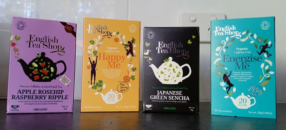
The English Tea Shop brand of teas provide a good example of design that is consistent both internally and externally.  Each tea has consistent design within it internally, but there are also enough similar elements used in each of the different varieties that the branding is still easily recognizable externally across varieties. They are easily identified as components of a whole, and this is consistency which “incorporates the visual flexibility to create identifiable regions and edges within the larger space” (Lynch & Horton, 2009, p. 98).  That is, the tea types are not exactly the same but are still recognizable and linked by certain consistent design choices.

tea smaller

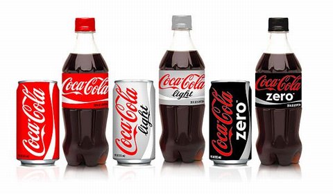
Coca-Cola has consistent branding across their products. Lynch and Horton note, “there is a paradox at the heart of consistency: if everything looks the same, there are no edges. How can you tell where you are or when you have moved from one space to another?” (Lynch & Horton, 2009, p. 98).  The answer is keeping a consistent design profile whilst tailoring small details to indicate difference.  For coke cans and bottles, each design is essentially the same, with colour indicating whether it is regular, diet or zero, and a font change for the ‘diet’ or ‘zero’ part.  The difference in products is instantly recognized by consumers, but always as a difference of product types within one brand.

6a00d83451b74a69e2013482cca7d1970c-pi

(https://7pennies.files.wordpress.com/2013/01/coca-cola-bottles.jpg)

Another example is public signage. Signs need to be simply and easily, if not instantly understood, especially if there is potential danger, or they are road signs which will be read whilst driving past.  The red circle and crossed line are universally and consistently used to indicate that something is forbidden.  This means that the learning curve for what a sign means is very small. This consistency of design allows for very effective usability and learnability.

stock-vector-set-of-signs-for-different-prohibited-activities-no-signs-no-smoking-no-drinking-no-249326569

learning portfolio 2 – Q1

Q1. Consistency

Consistency is a “cornerstone of good design” (DiMarco, 2011, p. 51).  Lidwell, Holden and Butler contend that consistency in design makes systems easier to learn and use, with consistent repetition of stylistic elements allowing users to “efficiently transfer knowledge to new contexts, learn new things quickly, and focus attention on the relevant aspects of a task”  (Lidwell, 2003, p. 46).  They go on to explain the four types of design consistency, aesthetic, functional, internal and external.

Aesthetic consistency refers to repetitive visual signifiers of a concept.  One example of aesthetic consistency is  corporate branding, where “Companies use the same color, fonts, and icons throughout their marketing materials (brochures, packaging, signage, etc.) to create a consistent experience for the customer through recognition and association” (DiMarco, 2011, p. 51).

Functional consistency helps to improve usability and learnability. For example, in web design “Users are not impressed with complexity that seems gratuitous, especially those users who may be depending on the site for timely and accurate information.” (Lynch & Horton, 2009, p. 106).  Thus in many cases functionality is achieved through the ‘shortcut’ of consistent design choices.

Internal consistency is the logical grouping and repetition of elements within a system. When creating a website, “For example, users will associate a particular color on your website as the “link color,” they’ll come to recognize the typeface of your body copy, etc. Therefore, being consistent in these areas will not only contribute to a great-looking design, but it’ll also provide a more familiar experience for users.” (T. Smith, 2010)

External consistency is extending internal consistency across different systems or components. For example, “If designing a number of items for the one event or business, they should all share a common look … you should share design elements between each” (M. Smith, 2014)

Consistency should be considered in all aspects of design, in order to create recognizable identities for the brand or system, and to make the user experience of a system simpler and easier to learn.


References

DiMarco, J. (2011). Digital Design for Print and Web : An Introduction to Theory, Principles, and Techniques. Hoboken: Wiley.  Retrieved from http://ECU.eblib.com.au/patron/FullRecord.aspx?p=537330

Lidwell, W., Holden, K., & Butler, J. (2003). Universal Principles of Design.

Lynch, P. J., & Horton, S. (2009). Web Style Guide. New Haven, US: Yale University Press.

Smith, M. (2014). The Principles of Graphic Design: How to Use Repetition Effectively. Edgee.  Retrieved from http://www.edgee.net/the-principles-of-graphic-design-how-to-use-repetition-effectively/

Smith, T. (2010). Consistency: Key to a Better User Experience. UX  Booth.  Retrieved from http://www.uxbooth.com/articles/consistency-key-to-a-better-user-experience/